Friday, September 27, 2013
Good Fridays - Zune HD
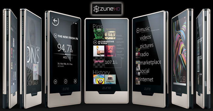
Zune HD
I have one, and I have used it every day for almost 3 years. It is a part of a dying breed, but it is a very well designed and well put together piece of technology. It has a sleek interface consisting of three physical buttons and a touch screen. It's arched back allows it to rest easily in the palm of the hand.
Tuesday, September 24, 2013
Top of the Top Tuesdays - Star Wars
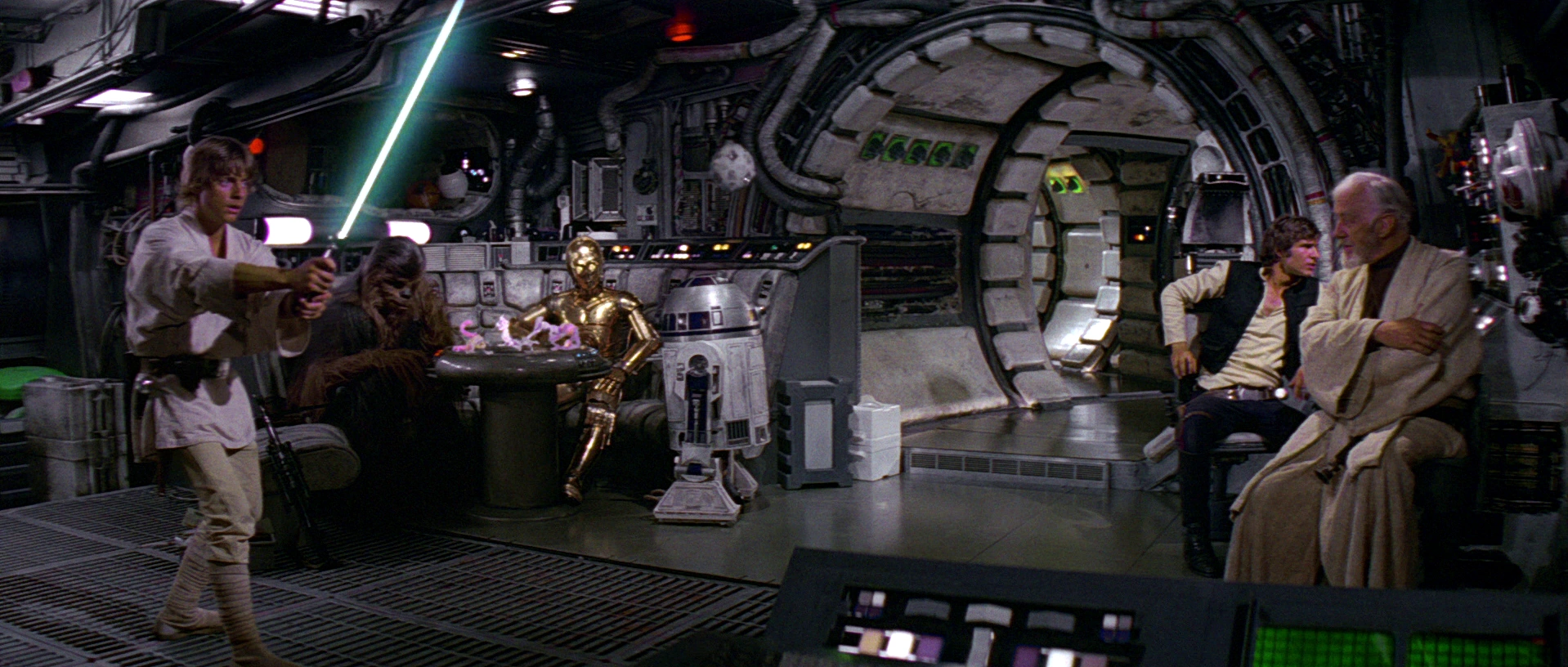
Star Wars
This film series started in 1977 and it has been one of the most influential on me out of almost anything. It is a series of sci-fi films that takes place across multiple fictional planets. It is a rather brilliant balance of futuristic and lived in. It seems very grounded in reality while also being extremely out of reach.


This film series started in 1977 and it has been one of the most influential on me out of almost anything. It is a series of sci-fi films that takes place across multiple fictional planets. It is a rather brilliant balance of futuristic and lived in. It seems very grounded in reality while also being extremely out of reach.
Wednesday, September 18, 2013
Who Designed It Wednesdays - The Chair
On Who Designed It Wednesdays, I will mostly post about well designed items who I don't know who designed them.
The Rocking Chair
I have no idea who designed it, but I went to Cracker Barrel with my family last weekend and I loved the rocking chairs. I can't find anything more than the first use of the word Rocking Chair in 1766.

The Rocking Chair
I have no idea who designed it, but I went to Cracker Barrel with my family last weekend and I loved the rocking chairs. I can't find anything more than the first use of the word Rocking Chair in 1766.
Monday, September 16, 2013
Moronic Mondays - Women's Jeans Pockets
On Moronic Mondays, I will post about bad designs.
Women's Jeans Pockets
 They are arguably nonexistent and if they do exist, they have no purpose. While I admire the design of the jeans themselves, the front pockets have no functional purpose because they are not deep enough to hold any proper items such as a wallet, phone, or pen. I mostly wrote about this because I'm tired of carrying around my girlfriend's stuff.
Women's Jeans Pockets
Friday, September 13, 2013
Good Friday - PS3 Controller
On good Fridays, I will post objects that I think are very well designed. They might not always be things I will use, but I tend to like their designs.
The PS3 Controller

The PS3 Controller
I am a gamer, but I don't not game on the PS3, though, I admire the design. It has a very clean, soft looking texture and layout. It is a rather balanced collection of both curved and straight lines. It has a very clean interface that is very easily differentiated, yet it is not that obscure or cluttered.
Tuesday, September 10, 2013
Top of the Top Tuesdays - Bioshock
I feel like the easiest way to get through this blog thing is to sometimes have reoccurring themed days. Top of the Top Tuesdays will basically be just me discussing my favorite designs in media; video games, movies, music, etc. I will try to pick one subject and then post examples.
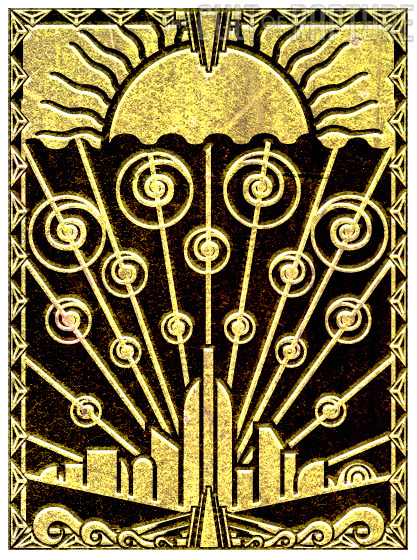
BIOSHOCK
 The 2007 video games phenomenon rocked the gaming world by storm, not just with it's beautiful story, dialogue and soundtrack, but by it's anesthetics and graphics as well. Taking place in a failed underwater utopia, the city was built in an art deco style. This game peaked my interests and inspired me to be an architect and later, a designer

BIOSHOCK
Tuesday, September 3, 2013
I'm Considering Switching Objects
My original intention was to use the multitool as my focus object. After some consideration, I'm leading more towards the Xbox 360 Controller. While the controller has far fewer practical uses, I fell like there was a vast amount of time put into the object's design and creation. While the multitool is more robust and industrial looking, the controller has a more elegant and sleek look. With simple colors and intricate curves, the controller seems to be a more visually stimulating object with it's own stylistic objectives. It is a difficult decision but I suppose I have to make it soon.
Poor Design
Such as this website. While this is supposed to be just a tool to show our abilities and growing knowledge of art and design, it is becoming increasingly annoying to use this format. The website itself, while being free, rather simple to use, and easily customizable to be properly utilized, has an amazingly broken post feature. When typing up a post and adding images, you can have the most clean and simple look imaginable and yet when you preview or post, the formatting will be scattered and twisted, being completely broken in comparison to the author's original intention.
I just find it to be very difficult to show our design knowledge if the format we are using to show this knowledge, is not properly allowing us to.
End rant.
End rant.
Sunday, September 1, 2013
Poster Design Project
In our design class, we were tasked with the objective of finding a well designed object. Normally, many would just look at the physical appearance of the object and look at the more superficial aspects of the item. Instead, I tried to also look into the more functional aspects of items I use in daily life. I tried to think of items that not only looked visually interesting, but also served their purposes well.
The objects I chose:
1. Xbox 360 Controller
5. Portable Charger
The objects I chose:
1. Xbox 360 Controller
 |
| Fits comfortably in the hand, has a proper balance of weight, its durable with a life span of over 6 years, simplistic. |
2. Guitar Capo
 |
| Fits the contour of the hand, easy to open, easily stays closed without applying too much pressure, the black rubber doesn't damage the strings or the neck, light weight and doesn't affect performance. |
3. Multi-Tool
 |
| Small, compact, clean and smooth design, durable material, long lasting. |
 |
| Opens up to reveal multiple tools, easy to open and differentiate tools, fits cleanly into hand. |
4. Pen  |
| Lightweight, molds to hand, simple color scheme, easy to replace ink cartridge. |
5. Portable Charger
 |
| Simple design, portable, compact wire with interchangeable charger pieces for different devices, charging wire charges phones and the actual charger, nice weight. |
Subscribe to:
Posts (Atom)